我正在参加中秋创意投稿大赛,详情请看:中秋创意投稿大赛
大佬们各显神通,绘制的月亮和动画一个比一个漂亮,特来学习。
圆月基调
月亮是晚上出现的,所以背景自然是黑色。
画圆咱们就不多说了,一个border-radius: 50%搞定。
基本框架代码如下:
1
2
3
4
5
6
7
8
9
10
11
12
13
14
15
16
17
18
19
20
21
22
23
24
25
26
| <!DOCTYPE html>
<title>
只画月亮
</title>
<body>
<div class="moon"></div>
</body>
<style>
body {
width: 100vw;
height: 100vh;
display: flex;
flex-direction: row;
align-items: center;
justify-content: center;
background: black;
}
.moon {
width: 200px;
height: 200px;
background: yellow;
border-radius: 50%;
}
</style>
</html>
|
基本展示效果如图:
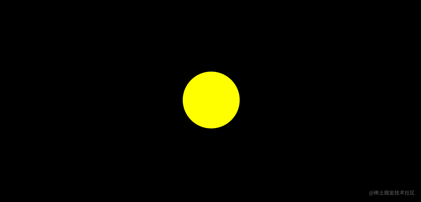
嗯,初步效果看着很不错,尤其我这种近视眼,月晕都不用加了…
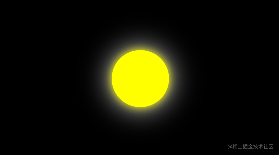
月光晕
使用box-shadow可以添加阴影效果,我们来试试看:
1
| box-shadow: x偏移量 | y偏移量 | 阴影模糊半径 | 阴影扩散半径 | 阴影颜色;
|
经过尝试,我们设定两层的光晕:
1
| box-shadow: 0 0 30px 0px yellow, 0 0 100px 0 white;
|
效果如下图所示:
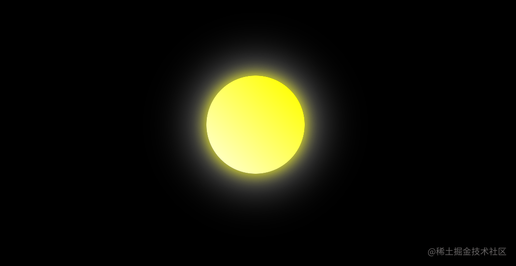
让圆变得立体起来
目前发现有以下几种策略:
渐变色背景
比如我们将月亮的背景色设置为:
1
2
3
4
5
6
| background-image: linear-gradient(
45deg,
lightyellow 0%,
yellow 90%,
yellow 100%
);
|
效果如下:
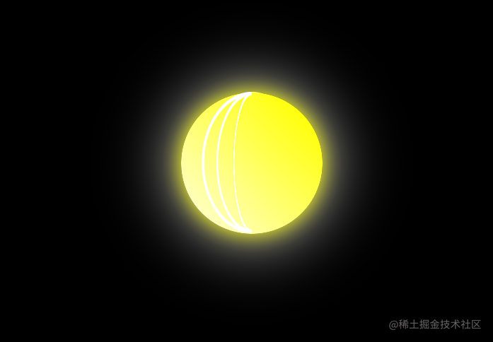
添加线条
从大佬文章中学到的,添加弯曲线条:
1
2
3
4
5
6
7
8
9
10
11
12
13
14
15
16
17
18
19
20
21
22
23
24
25
26
27
28
29
30
31
32
33
34
35
36
37
38
39
40
41
42
43
44
45
46
47
48
49
50
51
52
53
| .moon {
// 其他代码
position: relative;
}
.line {
width: 100%;
height: 100%;
background-color: linear-gradient(
45deg,
lightyellow 0%,
yellow 90%,
yellow 100%
);
border: solid 5px white;
border-radius: 50%;
margin: -0.5px;
position: absolute;
box-sizing: border-box;
transform: rotateY(45deg);
}
.line2 {
width: 100%;
height: 100%;
background-color: linear-gradient(
45deg,
lightyellow 0%,
yellow 90%,
yellow 100%
);
border: solid 5px white;
border-radius: 50%;
margin: -0.5px;
position: absolute;
box-sizing: border-box;
transform: rotateY(60deg);
}
.line3 {
width: 100%;
height: 100%;
background-color: linear-gradient(
45deg,
lightyellow 0%,
yellow 90%,
yellow 100%
);
border: solid 5px white;
border-radius: 50%;
margin: -0.5px;
position: absolute;
box-sizing: border-box;
transform: rotateY(75deg);
}
|
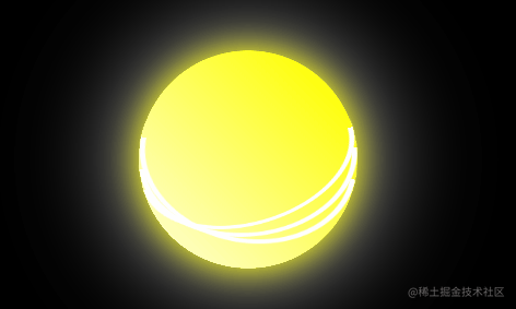
旋转
我们尝试让这个月亮旋转起来,然而效果,嗯,像极了以前看到的扁扁银河系,
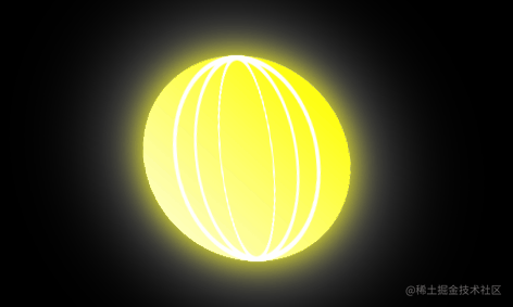
看来走偏了,应该添加一个固定的圆形背景,,或者说应该让线条转动起来,效果如下。嗯,还不错。
参考的站内文章:
原来3D感空间行星轨迹是这样画的
中秋节快乐,使用CSS3实现小火箭🚀绕月飞行
【中秋】纯CSS实现日地月的公转