这是我参与8月更文挑战的第26天,活动详情查看:8月更文挑战
通过本月的一些文章:
纯CSS制作跳动的心,
纯CSS制作一个小动画,
如何使用vue的transition做动画效果,
纯CSS实现奥运升国旗,
纯CSS实现轮播图,
纯CSS做旋转不断的效果,
纯CSS实现文字闪烁效果
我们已经初步了解了如何使用CSS做一些简单的动画效果。
今天就CSS动画的一个参数“animation-timing-function”。
animation-timing-function
MDN定义:
animation-timing-function属性定义CSS动画在每一动画周期中执行的节奏。可能值为一或多个 timing-function (经过在线确认,现在更名为easing-function)
对于关键帧动画来说,timing function作用于一个关键帧周期而非整个动画周期,即从关键帧开始开始,到关键帧结束结束。
定义于一个关键帧区块的缓动函数(animation timing function)应用到改关键帧;另外,若该关键帧没有定义缓动函数,则使用定义于整个动画的缓动函数。
通俗来说,animation-timing-function定义了一个动画帧周期的速度变化曲线,在《CSS揭秘》(CSS Secret)一书中,将其翻译为“调速函数”。我们先来看一下几个常用的参数动画效果。
源代码:
1
2
3
4
5
6
7
8
9
10
11
12
13
14
15
16
17
18
19
20
21
22
23
24
25
26
27
28
29
30
31
32
33
34
35
36
37
38
39
40
41
42
43
44
45
46
47
48
49
50
51
52
53
54
55
56
57
58
59
60
61
62
63
64
65
66
67
68
69
70
71
72
73
74
75
76
77
78
79
80
81
82
83
84
85
86
87
| <!DOCTYPE html>
<title>animation-timing-function</title>
<body>
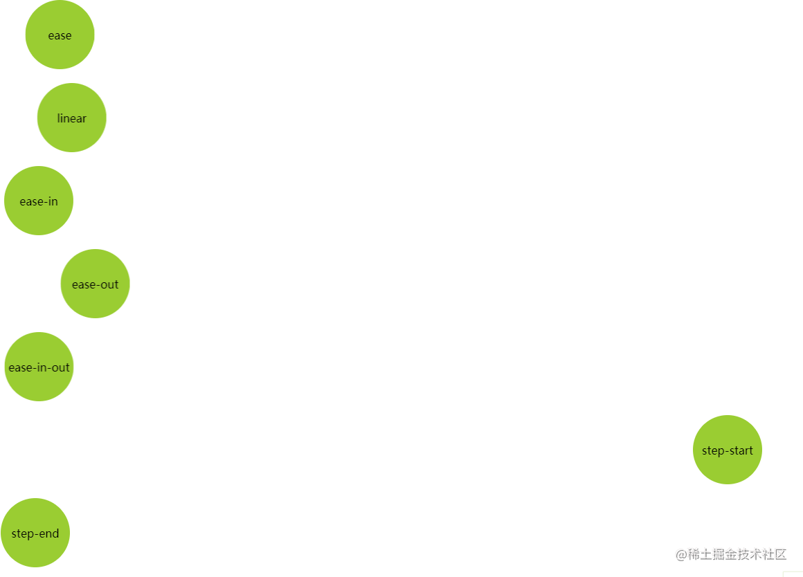
<div class="box1 circle">ease</div>
<div class="box2 circle">linear</div>
<div class="box3 circle">ease-in</div>
<div class="box7 circle">ease-out</div>
<div class="box4 circle">ease-in-out</div>
<div class="box5 circle">step-start</div>
<div class="box6 circle">step-end</div>
</body>
<style>
body {
width: 100%;
height: 100vh;
}
.circle {
width: 100px;
height: 100px;
border-radius: 50%;
background: yellowgreen;
margin: 20px 0;
display: flex;
flex-direction: row;
align-items: center;
justify-content: center;
}
.box1 {
animation: move1 5s linear infinite alternate;
}
.box2 {
animation: move2 5s linear infinite alternate;
}
.box3 {
animation: move3 5s ease-in infinite alternate;
}
.box4 {
animation: move4 5s ease-in-out infinite alternate;
}
.box5 {
animation: move5 5s step-start infinite alternate;
}
.box6 {
animation: move6 5s step-end infinite alternate;
}
.box7 {
animation: move7 5s ease-out infinite alternate;
}
@keyframes move1 {
100% {
transform: translate(1000px, 0);
}
}
@keyframes move2 {
100% {
transform: translate(1000px, 0);
}
}
@keyframes move3 {
100% {
transform: translate(1000px, 0);
}
}
@keyframes move4 {
100% {
transform: translate(1000px, 0);
}
}
@keyframes move5 {
100% {
transform: translate(1000px, 0);
}
}
@keyframes move6 {
100% {
transform: translate(1000px, 0);
}
}
@keyframes move7 {
100% {
transform: translate(1000px, 0);
}
}
</style>
</html>
|
从上到下,参数依次为ease(默认值), linear,ease-in,ease-out,ease-in-out以及step-start,step-end,其分别表示的含义为:
| 参 |
含义 |
| ease |
默认。动画以低速开始,然后加快,在结束前变慢。 |
| linear |
动画从头到尾的速度是相同的。 |
| ease-in |
动画以低速开始。 |
| ease-out |
动画以低速结束。 |
| ease-in-out |
动画以低速开始和结束。 |
| step-start |
直接跳转到动画最终状态 |
| step-end |
保持在动画开始状态 |
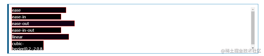
在MDNanimation-timing-function也有一个对应的例子:
前几个参数涉及到一个重要的函数,叫“贝塞尔曲线”。《CSS揭秘》中对贝塞尔曲线的介绍:
这种曲线由一定数量的路径片断所组成,各个片断的每一端都可以由一个手柄来控制曲率(这些手柄通常也被称作控制锚点)。一条复杂的曲线可能包含很多个片断,这些片断的端点彼此相连构成了整条曲线
如下图所示,就是端点在(0, 0)和(0, 1)的一条三次方贝塞尔曲线,横坐标代表时间,纵坐标代表动画进度。通过两个两个控制点可以完全自由的控制这条动画变化曲线。如下图两个控制点(锚点)绘制出的贝塞尔曲线如下图所示。
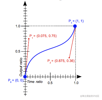
ease 等价于 cubic-bezier(0.25, 0.1, 0.25, 0.1)
cubic-bezier(x1, y1, x2, y2)
这个函数要求x1, x2在范围[0, 1]内,因为x代表时间,我们无法穿越时间范围定义动画开始之前以及动画结束之后的时间。当然,y1, y2是可以超出范围的,感兴趣可以试试如果将y1, y2设置为负数为有什么效果。